
Microsoft continues to innovate one of my favorite tools, Excel. I love charts and they just added six new types!

Treemap provides a hierarchical view of the data
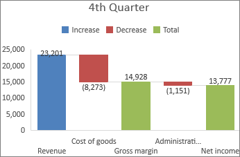
Waterfall shows a running total, both positive and negative

Pareto is used to highlight your largest factor in a data set
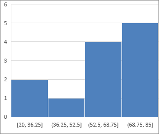
Histogram is used to show frequency data

Box and Whisker shows distribution of data and highlights outliers

Sunburst shows hierarchical data via rings
Which one is your new favorite chart?
~ GW

